
Analysis Editor
Learn more about the Analysis Editor and how to configure your analysis for viewers.
Access requirements
Permission with these capabilities:Create Captures & Analyses
Reach out to your administrator for access.
Overview
The Analysis Editor is what you will use to create and edit your analyses, as shown in the following illustration. The Analysis Editor allows you to enter or change the title of your analysis and insert content including text, charts, links to other analyses, and images.
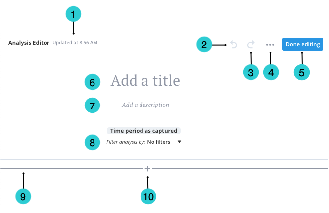
- Autosave timestamp: This timestamp reflects the last time at which your analysis changes were automatically saved.
- Undo: Undo your last action.
- Redo: Redo your last action.
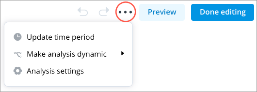
- More items:
- Update time period: Have the analysis show data for the latest time period or a specific time period.
- Analysis settings: Contains options for controlling the default analysis behavior. The Analysis settings button
 may appear directly in the Analysis Editor instead of under More items.
- AI explanations: Allow viewers to see AI generated summaries of the insights in the analysis. For more information, Generate an AI explanation.
- Allow resharing: Give editors the ability to share the analysis with others. For more information, see Allow editors to reshare an analysis.
- Layout mode: Choose a layout for the analysis. The narrative layout is narrow, ideal for telling a story with lots of text describing the content within the analysis. The dashboard layout is a condensed layout, with less white space, allowing you to display more data on the screen. Narrative is the default layout.
- Default view mode: Choose whether viewers see all the analysis content when they open the analysis. Expanded is the default view mode. When you set the view mode to Collapsed, the headings will remain expanded in the Analysis Editor.
Edit preview appearance: Change how links to this analysis appear. For more information, see Change the Analysis Link Preview Appearance
- Make analysis dynamic > Edit dynamic analysis properties: Make your analysis dynamic by adding parameters, insight parameters, formulas, and analysis transformations. For more information, see Create a Dynamic Template.
- Make analysis dynamic > Drop context: Choose the filters to remove from the visuals in this analysis. This will optimize the analysis for sharing with other users.
- Done editing: Close the Analysis Editor.
- Title box: Add a title for the analysis. This title appears in search results and is used in analysis links.
- Description box: Add a subtitle or description for the analysis.
- Driving Subject: Set a Driving Subject to allow viewers to change the analysis context by applying filters to all the charts in the analysis at once.
- Divider: A horizontal line that separates content into different rows.
- Insert: Add content such as headings, text, charts, and analysis links.
Tip: Watch this video to learn how to select the Driving Subject, remove filters, and set up the data refresh settings. These settings determine how users can interact with your analysis.
The Driving Subject
It can be difficult for viewers to determine how filters will be applied to charts in an analysis when the analysis contains charts that look at different subjects. To simplify the viewing experience, viewers will not be able to add filters on the analysis level (change the analysis context) by default.
However, you can allow viewers to change the analysis context for all charts in an analysis at once by setting a Driving Subject. We recommend that you do this when the majority of the charts in your analysis look at a single subject such as Employees. When you set a Driving Subject for your analysis, viewers will only be able to add filters for the subject. After a Driving Subject is selected, you can also add a set of default filters to your analysis. Viewers will not be able to remove the default filters and any filters that they add will be applied on top of the default filters.
Example: Adding filters at the analysis level
You're viewing an analysis that contains the following charts:
- Breakdown of Headcount by Organization
- Breakdown of Average Performance Rating by Organization
- Breakdown of Open Positions by Organization
The Driving Subject for the analysis is the Employee subject.
You want to look at data for first year employees in Marketing and Sales, so you change the analysis context by adding the following filters:
- Tenure: 0-1yr
- Organization: Marketing, Sales
If applicable, filters will be applied to all charts in the analysis at once. The following table describes how the filters are applied.
| Chart | Applied filters |
|---|---|
|
Breakdown of Headcount
|
|
| Breakdown of Average Performance Rating |
|
| Breakdown of Open Positions |
|
In this example, the analysis contains charts that look at multiple subjects. The Headcount and Average Performance metrics are based on the Employee subject while the Open Positions metric is based on the Requisition subject. The Tenure filter can only be applied to metrics that are based on the Employee subject, so the filter is dropped from the chart Breakdown of Open Positions. The Organization filter can be applied to metrics that are based on the Employee or Requisition subject, so the filter is applied to all charts in the analysis.
To set a Driving Subject for your analysis:
- In the Analysis Editor, click the drop-down arrow on the right side of Filter analysis by and select the subject that viewers can apply filters for.
Note: The available subjects are determined by the charts you have in your analysis. You can only set one subject as the Driving Subject.
Simplify filters for analysis viewers
Improve your viewers' experience by simplifying the choices they have to make when filtering your analysis. You as an analysis author can simplify filters for your viewers by applying a default filter, adding suggested filters to the analysis context, and replacing the default suggested dimensions in the Filter picker.
- Viewers are not limited to the filters you add and can choose to filter by any attribute available in See all filters.
- Suggested filters without selected members do not carry over when clicking links to other analyses.
Add a filter
Set a Driving Subject. For more information, see The Driving Subject.
On the Analysis Context toolbar, click Add a Filter ![]() .
.
Apply default filters to your analysis
You as an analysis author can make it easier for viewers to navigate your analysis by applying default filters so that your analysis loads with the most relevant filters applied.
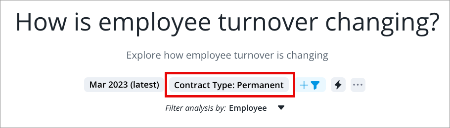
For example, let's say you as an analysis author learn that most users viewing your Employee Turnover analysis are only interested in data for permanent employees. You can apply a default filter to load the analysis with the permanent employee filter applied, making it easier for analysis viewers to get to insights.
- Click See all filters... to open the Filter picker in full screen.
- Search for and select the concept or dimension you want applied as a default filter.
Note: If you choose a dimension, you can choose the members you want to filter the analysis by.
- Apply your changes.
Result: Your analysis is filtered by the concept or dimension members you applied.
Add suggested filters to the analysis context
As an analysis author, you can add the most relevant or impactful filters to the analysis context, making it easier for users to navigate and filter the analysis.
For example, as an analysis author, you can add Contract Type and Location Hierarchy as suggested filters to an Employee Turnover analysis.
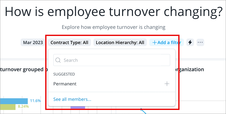
- Click See all filters... to open the Filter picker in full screen.
- Search for and select the dimension you want to add as a suggested filter to the analysis context.
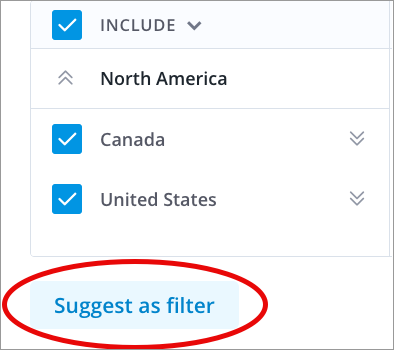
- (Optional) Select the members you want to add as suggested members.
- Click Suggest as filter.
Result: Your suggested filter appears in the analysis context.
Replace the default suggested dimensions in the Filter picker
You as an analysis author can replace the suggested dimensions in the Filter picker with suggestions more relevant to the analysis being viewed, making it easier for analysis viewers to navigate and filter your analysis.
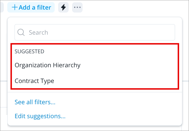
For example, you can add Organization Hierarchy and Contract Type as suggested dimensions to an Employee Turnover analysis.
- Do one of the following:
- Click Edit suggestions....
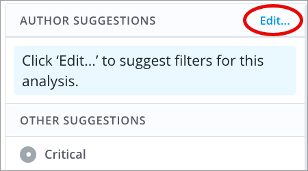
- Click See all filters... to open the Filter picker in full screen and click Edit... in Author Suggestions.
-
Select the attribute you want to add as a suggested dimension.
Tip: You can reorder your suggested dimensions using the
 icon preceding each suggested dimension. For example, you can order the suggested dimensions from most relevant to least relevant, most impactful to least impactful, or another order that benefits your analysis viewers the most.
 - Apply your changes.
Result: Your suggested dimensions appear in the Filter picker.
Publish your changes
Click Done editing to publish your changes.
Remove filters from charts in the analysis
When you add a chart to an analysis, the chart will retain its local context (filters that were applied at the time of creation). If you're sharing your analysis with users who have different levels of data security access, you should remove the local context from all the charts in your analysis. If you don't, viewers may not be able to see some of the charts in your analysis because they do not have sufficient data security access to the population that is specified by the applied filters. Once the local context is removed, the charts will reflect the security access of the viewer.
To remove filters from the charts:
Note: You cannot undo this action.
- In the Analysis Editor, click the More items button
 > Make analysis dynamic > Drop context.
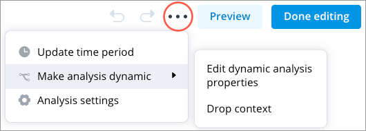
- In the Drop Context dialog, select the applied filters you want to remove.
Note: Only filters applied to charts during their creation (as opposed to filters applied on the analysis level) will appear.
- Click Apply.
Result: The filters are removed from all charts in the analysis.
Refresh analysis data
By default, analyses are static and show data at a fixed point in time. When you add a chart to an analysis, the chart will retain its local time context (the time period and granularity that was set when the chart was created) and the data will not change over time. However, you can automatically update your analysis so that the charts show data for the latest time period or you can manually update your analysis so that the charts show data for a specific time period.
Note: If you set your analysis to update automatically, you'll be making your analysis dynamic. Viewers will be able to apply their own time context (change the time period) on the analysis level, which will override the local time context of all the charts in the analysis.
To set up your data refresh settings:
- Do one of the following:
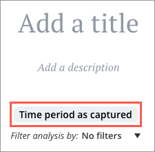
- In the Analysis Editor, click the Time period label.
- In the Analysis Editor, click the More items button > Update time period.
- In the Analysis Editor, click the Time period label.
- In the Update Time Period dialog, choose one of the following settings:
- Time period as captured: charts will retain their local context and display data for the selected time period and granularity at which the chart was initially created.
Note: Charts that contain a cohort definition that uses a dynamic time context will not work correctly with this option.
- Update automatically: charts will continuously update to display data for the latest time period (even if that week, month, or year has not yet completed).
Note:
- You can select the time granularity to update to automatically. The data in your analysis will update depending on the granularity selected. The default granularity is months.
- To avoid displaying partial period data, select the Update to latest complete time period box.
- To allow viewers to change the granularity for all charts in the analysis, select the Synchronize chart/time picker granularity box. For more information about the viewer's perspective, see How the time granularity is applied at the analysis level.
- Data in charts with a fixed time setting will not change when the time period or granularity of the analysis is changed, even if the analysis has the time granularity synchronized. Fixed charts will be indicated by a lock icon
 beside the time period. For more information, see The Time Context.
- Set a specific time period: charts will display data for the selected time period.
Note:
- To apply the granularity that you selected to all charts in the analysis, select the Synchronize chart/time picker granularity box.
- Data in charts with a fixed time setting will not change when the time period or granularity of the analysis is changed, even if the analysis has the time granularity synchronized. Fixed charts will be indicated by a lock icon beside the time period. For more information, see The Time Context.
- Time period as captured: charts will retain their local context and display data for the selected time period and granularity at which the chart was initially created.
- Click Apply.
Result: The settings will be applied to all charts in the analysis and the label under the description of your analysis changes to indicate the data refresh settings that have been applied.
Example: Applying auto refresh data settings to your analysis
Let's say:
- You have a chart in your analysis that shows the Breakdown of Turnover Count by Organization for July 2018 at a monthly granularity.
- The latest data that is loaded to the solution is for March 8, 2019.
The following table describes the data that is displayed in the chart based on the auto refresh data settings that have been applied to the analysis.
| Auto refresh setting | Data displayed |
|---|---|
| Update automatically | Turnover Count for March, as of March 8, 2019. |
| Update to latest complete time period | Turnover Count for February 2019. |